01
Understanding UI as Part of Game Design
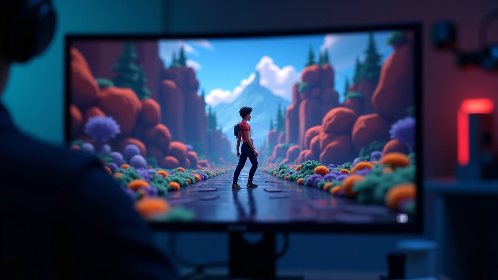
Here’s the thing about game UI—it’s invisible when it works well. Players shouldn’t be thinking about menus or HUD elements. They should be thinking about the game itself. But when UI fails? Everyone notices.
We’re not just talking about making buttons look pretty. Good UI in games is about hierarchy, feedback, and clarity. When a player opens your inventory, they should instantly understand where things are. When they take damage, the HUD should communicate that information clearly without screaming at them. That’s the balance we’re aiming for.

02
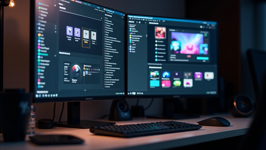
Canvas and Layout Systems in Unity
The Canvas is where everything lives. It’s your playground for UI elements in Unity. You’ll want to understand how it scales across different devices—because players are running your game on phones, tablets, and PC monitors of all sizes. Not just one screen.
Key Layout Components
- Canvas Scaler: Adapts UI to screen resolution and aspect ratio
- Layout Groups: Automatically arrange child elements (vertical, horizontal, grid)
- Anchors & Pivots: Control how elements position relative to parent
- Safe Area: Respects notches and screen edges on mobile devices
The Canvas Scaler is your best friend here. It lets you design at one resolution and have everything scale intelligently. We’re talking about supporting 4:3, 16:9, and those odd mobile aspect ratios without redesigning the whole interface.
03
Button States and Interactive Feedback
Buttons are the most basic UI element, and they’re also where most games mess up. A good button should respond to player interaction—immediately. We’re talking about four states: normal, highlighted, pressed, and disabled.
When a player hovers over a button, something should happen. Color change, scale animation, sound effect—pick your poison. But it needs to be instant. Nobody wants to wonder if they’re actually hovering over something. The key is consistency. If one button animates on hover, they all should.
Normal State
Default appearance. Players see this when nothing’s happening. Keep it clean and readable.
Highlighted State
Player is hovering or has it selected. Use color, scale, or glow effects. Make it obvious.
Pressed State
Player clicked it. Quick visual feedback confirms the action was registered.
Disabled State
Button can’t be clicked. Desaturate it or dim it so players know why it doesn’t work.
04
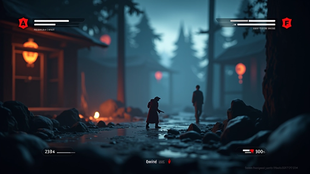
HUD Design and Real-Time Information
Your HUD is the player’s connection to game state. Health, ammo, minimap, objective markers—it all lives here. The challenge is showing enough information without cluttering the screen so much that players can’t see the actual game.
We typically use screen corners and edges for persistent information. Top-left for objectives, top-right for score or time, bottom-left for inventory, bottom-right for minimap. It’s not a law—it’s just what players expect. When you break those conventions, make sure there’s a good reason.
of players notice poor HUD layout
typical reaction time for health warnings
ideal number of HUD elements at once
05
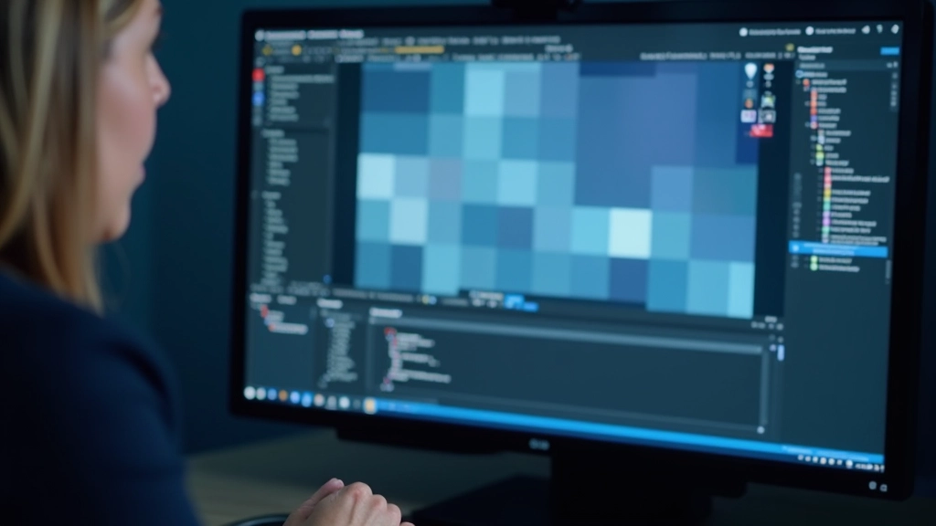
Performance and Best Practices
Here’s where a lot of UI breaks down—performance. Every UI element is a draw call. Too many canvases? You’ll tank your framerate. Rebuilding the canvas every frame? Same problem. We need to be smart about this.
Use layout groups sparingly because they recalculate every frame. Cache references to your UI elements instead of finding them with GetComponent every update. And seriously—test on actual target devices. That Android phone from 2019 won’t perform like your dev machine.
UI Optimization Checklist

Making UI Disappear
The best UI is the kind players don’t think about. They press a button and things happen. They look at the HUD and instantly understand their situation. There’s no confusion, no searching for information, no wondering if the game heard their input.
This takes iteration. You’ll build something, test it with actual players, and realize buttons are too small or the HUD is cluttered. That’s normal. Every game is different, and what works for a fast-paced action game won’t work for a puzzle game. Keep testing, keep refining, and you’ll get there.
Start with the fundamentals—clear hierarchy, responsive feedback, and smart layout systems. Master those, and you’ll be building UIs that players actually enjoy using.
Disclaimer
This article provides educational information about game UI design principles and Unity implementation practices. Every game has unique requirements based on genre, target platform, and player expectations. The techniques described here are starting points—your specific implementation will depend on your game’s needs, performance constraints, and creative vision. Always test thoroughly on your target devices and gather feedback from actual players during development.